TheThreeBestComplementaryColorSchemesforBlueAComprehensiveGuide
- 家庭
- 2025-01-16 17:43:16
- 1796
In the realm of design and color theory, blue is a versatile hue that can evoke a wide range of emotions from calmness to serenity. However, when it comes to choosing colors to pair with blue, many find themselves in a dilemma. This article will explore the three best complementary color schemes for blue, providing you with an understanding of how these combinations enhance your design projects and create visually appealing outcomes.
Understanding Complementary Colors
Before diving into specific color schemes, it is essential to understand the concept of complementary colors. In color theory, complementary colors are pairs that sit opposite each other on the color wheel. These contrasting hues complement one another when placed side by side, creating a vibrant and dynamic visual impact. For blue, its main complements include yellow, orange, and red.
Scheme 1: Blue and Yellow
# Hue and Tint
The classic combination of blue and yellow is both striking and eye-catching. When used together, these colors can evoke feelings of joy, happiness, and optimism. The warmth of yellow against the coolness of blue creates a balanced contrast that can make any design more engaging.
# Practical Applications
1. Fashion: A blue blouse paired with a yellow skirt or vice versa can create a fun and fresh look.
2. Web Design: Yellow buttons on a blue background can draw attention to important elements, making them stand out.
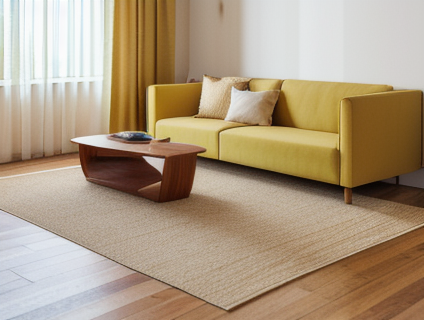
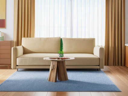
3. Interior Design: A blue sofa with yellow throw pillows or accent cushions can add brightness to a room.
Scheme 2: Blue and Orange

# Hue and Tint
Blue and orange are another powerful pair that creates an immediate visual interest. This combination is often used in design projects aiming for a modern, fresh feel. The cool tones of blue can balance the warmth and energy of orange, resulting in a harmonious yet dynamic look.
# Practical Applications
1. Branding: A logo with a blue base and orange accents can make it stand out on social media or business cards.
2. Marketing: An advertisement featuring blue skies and orange sunsets can evoke feelings of relaxation and warmth.
3. Web Design: Orange call-to-action buttons against a blue background can encourage user interaction.
Scheme 3: Blue and Red
# Hue and Tint

While not as commonly used, the combination of blue and red creates an intense and dramatic effect. This pairing is ideal for designs that require high contrast or a bold statement. The coolness of blue contrasts sharply with the intensity of red, making it perfect for highlighting important elements.
# Practical Applications
1. Fashion: A red dress paired with blue accessories can make a striking fashion statement.
2. Branding: A brand name in blue with a logo that includes a bold red element can leave a lasting impression.
3. Marketing: An ad campaign featuring blue backgrounds and red text or imagery can quickly capture the audience's attention.
Choosing the Right Complementary Colors
Selecting the right complementary colors for your design project depends on several factors, including the overall mood you want to create, the intended purpose of the design, and the target audience. Here are some tips to help you choose effectively:
1. Mood: Consider the emotions you want to evoke through your design. For instance, if you're aiming for a calm and relaxed atmosphere, yellow might be more suitable than red.
2. Purpose: Determine whether you need a vibrant, eye-catching look or a more subtle and sophisticated one. This will influence which complementary colors are best suited.
3. Audience: Think about your target audience's preferences and cultural context. What resonates with them? Are they more likely to respond positively to warm tones or cool ones?
Conclusion
In conclusion, blue can be paired effectively with yellow, orange, or red, each offering unique benefits and applications in various design contexts. By understanding the principles of complementary colors and considering the specific needs of your project, you can create designs that not only look great but also resonate emotionally with your audience.
Remember, color choice is subjective and highly dependent on context. Experimenting with different combinations will help you find the perfect match for your creative vision. Whether you're designing a website, fashion collection, or marketing campaign, these complementary color schemes provide valuable insights into creating visually appealing and impactful designs.